

10 exciting design tips to make your infographic look more polished
Creating an infographic takes more than just solid data and explanatory text. Even pretty graphics won’t save an infographic if some fundamental design skills aren’t met. You can make your infographic look more polished by implementing a few basic principles of design. So today, let’s go over 10 design tips that you can use to take your infographic from meh to amazing!
1. Add white space to allow your design to breathe.
The most common mistake I see when people make their first infographic is crowding everything close together. This causes tension and lessens readability. This doesn’t mean that you can’t have overlapping elements, but the overlap can’t get in the way of the readability of the graphic. More on how to use overlapping elements to improve your infographic in a moment (see #6).
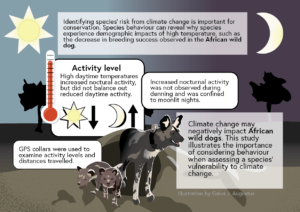
In addition to the space between elements, you should be sure to leave some space around the edges. This “white space” can have visuals, but nothing that is necessary to understand the piece. In the infographic below, notice that the sun, moon, trees, etc are close (though not on) the background. However, everything that is important is well within the graphic.
When you are working to make your infographic look more polished, giving breathing room can make a huge difference.
2. Use readable fonts that mesh well together.
Are you one of those people who loves beautiful and intricate fonts that are (let’s face it) really hard to read? I get it. I love pretty fonts, but I know that certain fonts work well together and make a piece more readable while others just cause frustration and busyness.
Display fonts (which can be highly stylized or cursive fonts) are appropriate when they are incredibly relevant to your infographic. You should mainly use these fonts for the title and maybe in the headings, depending on how hard it is to read. If you aren’t sure, don’t use it.
I’m often asked how many fonts can be used, and my answer is usually to pick 2 fonts. If you’re worried about whether they match or not, just use one font and use variations of it (larger, bold and smaller, narrow) to create the feel of two fonts without worrying about them clashing.
As far as readability, sans serif fonts are typically easier to read in the body text, while serif fonts can give a feeling of professionalism. Consider pairing a serif font in the headings with a sans serif font in the body. Also, some fonts come in a sans serif and serif style. If you find one of these, it can work to your advantage to use them together for the body and header fonts.
Display font example
Sans serif font example
Serif font example
I’ve found that a strong font can really elevate a design. So, if you want to make your infographic look more polished, go for a professional font. Don’t worry, there are a TON of free fonts available. The ones above are from Google Fonts.
3. Group like items together with color, spacing, or boxes.
An important element of any design is using visual cues to guide your audience’s eye. Often, you’ll need to find ways to make certain objects appear to be grouped together in some way. In the left panel of the below example, there are 48 identical circles with equal space between them. This appears to an audience as 1 group of 48 items. The other pictures in the gallery below use different methods to break that group up.
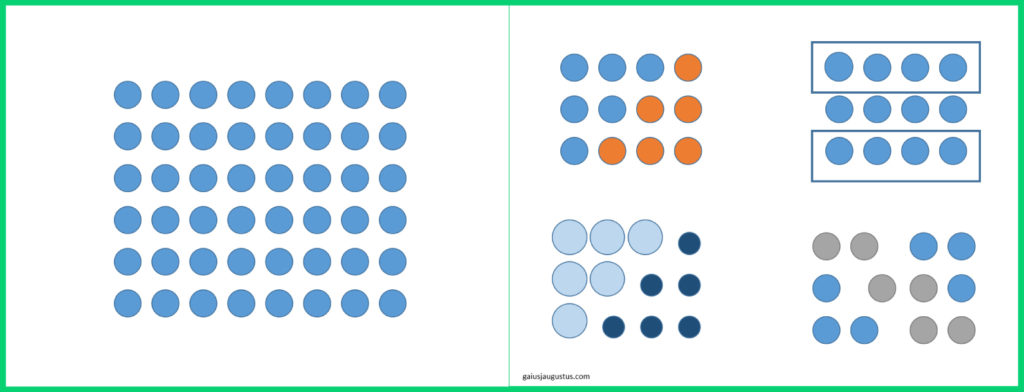
First is spacing. Things that are close together appear to be grouped together, and things that are more separated appear to be different groups. By adjusting the space between each circle, I’ve created separate groups of objects. Next is color. Similar to spacing, things that are the same color tend to appear to be grouped together. By giving the circles different colors, I’ve visually separated the circles into multiple groups. Separating groups by putting boxes around them is another way that can be used.
4. Use a harmonious color palette.
Choosing a color palette for your design might leave you a bit nervous, and that’s okay. Color theory is a complex topic with many nuances. Instead of trying to fit all that theory into this post, let me instead share some tips and resources with you to help you find a working color palette.
Color palette tips:
Color palette resources:
One of the most unprofessional mistakes in creating any visual piece is using an annoying, unappealing, or hard to read color palette. Make sure there is contrast (lights and darks) and that your text is easily readable. When in doubt, use color palettes that already exist (like those above). A nice color palette can definitely make your infographic look more polished!
5. Keep lines of text short & font size readable.
It’s far more difficult to get through a line of text that is super long! This is one reason why textbooks typically print pages with 2 columns of text. Consider keeping line length down to 40-80 characters. The optimal line length is somewhere in the middle, around 50-60 characters long.
I’ve worked with people in the past who make their font size small because they want to fit more text. This is a bad idea for a couple of reasons: 1) small text is harder to read in general, 2) the same font size may not be readable in different formats (eg, Instagram vs print), and 3) often smaller text leads people to longer line length.
If you’re unsure if your text is too small, here’s a quick tip. Try viewing your image at 50% in whatever art program you are using to create your design. At half size, you should still be able to read the text somewhat. If you’re still unsure, try backing away from your image, putting at least 3 ft between you and the words. If you’re still unsure after this, make the text a bit bigger.
This, of course, also means you need to be aware of how much text you can fit in your infographic. You may need to remove excess wordiness or extra details to make the text fit well. If you realize that you need to consider a different platform to post your infographic, or that you need to split it into more than one infographic. It’s better to do one of these than to create an infographic with small text or long line lengths.
6. Add levels of interest using foreground and background.
This tip is all about making space seem 3-dimensional. One way to make your infographic stand out is to make certain parts feel like they are “behind” other parts. Take the below infographic as an example.
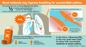
The inhaler at the bottom left of the image appears to be in front of the lungs in the background because 1) it’s overhanging the blue bar at the bottom that is obscuring the lung image and 2) it has a shadow underneath it. Consider overlapping elements to give your design some interest.
Infographics with levels look more professional and often come across as more visually interesting. So consider overlapping elements to make your infographic look more polished. Just remember to follow the other tips in this post as well so that you don’t lose readability.
7. Use a highlight color for emphasis.
Not all colors are created equal in a design. In other words, you don’t necessarily want to use your 2-3 main colors equally. I typically choose one color to be a highlight color. The highlight color will be the color that is the most eye-catching or the most unlike the other colors in the palette. Then, I use that color for a purpose. In the above example, I used orange to highlight anything related to the molecule of interest: the title, the PAR2 molecule, the inhaler, and the effects of the molecule.
Here are a few color palettes and the color I would choose to be the highlight color:
| https://colorhunt.co/palette/167908 | Orange |
| https://colorhunt.co/palette/167860 | Blue |
| https://colorhunt.co/palette/167694 | Red |
| https://colorhunt.co/palette/166114 | Yellow |
| https://colorhunt.co/palette/165293 | Orange |
| https://colorhunt.co/palette/167664 | White (not listed in palette) |
In a monochromatic color palette, I often choose to use white or black as my highlight color.
A highlight color will make your infographic look more polished by giving it a sense of flow. Speaking of which…….
8. Determine the proper flow of information to improve readability.
A quick way to lose a reader is to make it difficult for them to understand what order to read in. If you’re writing in a western language, your infographic should read top to bottom, left to right. If two boxes are at the same height, your audience will read the left box first.
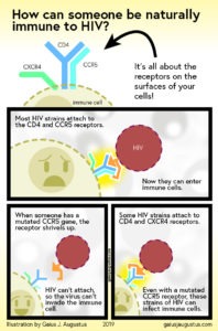
In this example infographic, I expect the title to be read first. The text in the graphic at the top may be read next, but the first block of text should be read rather quickly. Then we move into the first box and read the top-left text and then the bottom-right text. In the bottom row, the audience should instinctively know to read the two blocks of text from top to bottom in the left panel before moving on to the right panel.
Here’s what I do to test the flow of every infographic. I place the text and rough imagery into the infographic first. Then I leave it alone for a few days. Once I’ve given my mind enough time to recharge, I open up my infographic and read it out loud, as I look at it. If I notice that my eyes are jumping around or I need to pause for a moment to figure out what to read next, I know something is off.
9. Create a balanced composition.
This can sometimes be a difficult concept to grasp because it doesn’t just mean symmetrical. Balance has many facets that are interconnected, but I’m going to do my best to simplify it here. That’s because improving the balance of an infographic is a powerful way to make your infographic look more polished and professional.
The basic principle is that every element in your piece (ie, blocks of text, visual elements) holds some amount of weight, and we want that weight to be balanced throughout the piece.

Here’s an example of a piece that is primarily text. But it still holds balance. The blue in the top left is balanced with blue in the bottom right. There is quite a bit of red weighing down the bottom left, so I added a block of text to ground the top right. And all the text in the top of the piece is balanced with a heavy block of red at the bottom. I kept most of the font on the bottom thin in order to let as much of that color come through.
10. Connect pieces of information visually.
This last tip may make it easier for you to get started because it allows you improve the flow and balance of a piece in a very intuitive way. Connecting pieces of information in your infographic is more literal than it may seem, so let me show you an example.

This infographic is divided into 2 parts. The top part describes the clinical trial that I was hired to create an infographic about. The bottom describes why the results of the trial make sense. I’d like you to focus on the bottom part of the infographic.
I had quite a bit of text that I needed to get in here, and it had a story-like vibe. So I divided the text into manageable blocks (the light blue boxes), and then connected the information with a solid grey line. That grey line actually leads the audience through the piece, acting like a path for the eyes.
This method works well for stories, but it also is extremely effective for process-based infographics. If you have a process with several steps, you can connect them with a line, arrows, or some other visual equivalent. The best part is that you automatically have a sense of flow, which helps the audience.
I hope these tips inspire you to get started designing your infographic. I think you’ll be surprised how much small details can improve the visual appeal. As always, practice makes perfect, and the more you implement these and other design skills, the better you’ll get.