
The Anatomy of an Infographic
An infographic is a fantastic way to share the results of research and analyses. The mix of images and text can turn a daunting topic into a narrative that is easy to understand. But what information should you include? How many images? How much text?
If you’re interested in creating your own infographic, this post is the perfect place to start. As you’ll see, the planning step of creating an infographic may be the most important.
Let’s start by talking about the parts of an infographic and how you can get started putting yours together!
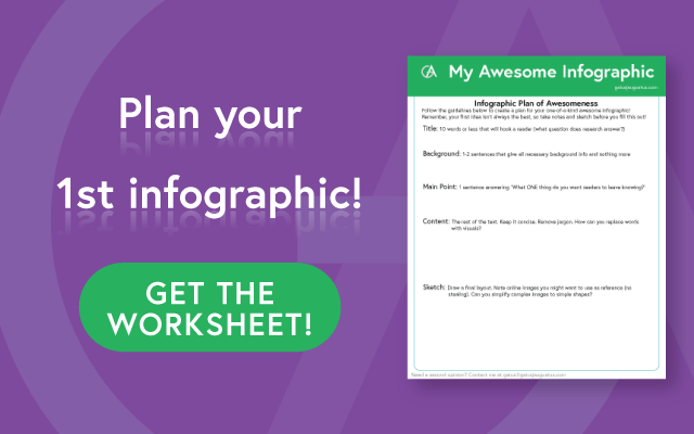
Don’t forget to grab the worksheet at the end of the post, which you can use to plan out your infographic!
What do all infographics have in common?
At the most basic level, I need two things: information and graphics. Yes, it’s a smartass answer, but it’s also true! Infographics need to have a strong graphic element, but they are nothing without data and information.
The bulk of the information that is included will be in the form of explaining the main topic, but let’s back up from that a moment. Before we go digging into the nitty gritty of every block of text, we need to think about the big picture.
The main point
Before you start, there is one question that you need to answer:
What is the one thing you want people to come away remembering?
This question is extremely important. It will decide what content is relevant and what is extraneous. The question guides the kinds of images you should use and even the color palette. I’m not exaggerating when I say that if you cannot pin down this question into one sentence, you should pause here and work on that. And I’m not talking about those run on sentences that we like to use to tie 15 ideas together. This needs to be an easily readable sentence like the following.
Once you’ve got your main point, you can move on to things that may come more naturally to you.
The background info
In order to understand your main point, your reader needs to know why it’s important. To know why it’s important, your reader may need some extra information to get caught up with you. The most important thing you can do here is to identify your audience. Based on the knowledge of your ideal audience, you may need to either start from scratch or leave out information that is common knowledge for the group.
For example, I created several graphics for a donor magazine. These donors were normal, everyday people (not scientists) who had given money to the cancer center. However, the average level of education for the group was a college education.
I chose to target my infographics with this in mind. They would understand what cells and genes are (at least the concept) but probably didn’t know much about how the immune system works. Identifying my audience allowed me to create graphics that got rave reviews. This could easily have gone wrong. If the graphics were too scientific, people would have been lost. On the other hand, if the graphics were too simple, the point would be lost.
You need to make these decisions as well, and figure out what background information is necessary. As a general rule, I try to keep my background to 2-3 sentences. Here are some examples.
Finding a title for your infographic
Before we move on to the last section, let’s take a moment to think about possibly the most important part of your infographic. That’s because if your title doesn’t get the attention of your audience, they won’t read on to the important information in your graphic.
The best title should capture the attention of your audience without being too much like click bait. Some of the best titles for scientific infographics focus on the research question. Other good titles give a glimpse as to why the main point is so important.
Your title needs to be short and sweet and informative and captivating. You don’t have to use your first idea. It’s a good idea to do some brainstorming. Even once you get a title you like, try mixing up the words or rephrasing it. Then leave it for a little while. Usually, when you come back, the best option will jump out at you.
And FINALLY, the content
This tends to be where most people start, but I actually think this should be the last thing you prepare for your infographic. At this point, you have an understanding of the beginning (what background you’ve given) and end (the main point) of your story. The framework of your story you now have will guide you in creating the rest of the content.
The most common mistake I see people make when creating the content is that they include way too much information. You want to include all the information to get from your background to your main point, but no more than that. Extraneous information will confuse your message. Remember, you can always make another infographic.
If you are struggling with how to best reduce jargon, maybe it’s time to get another pair of eyes on it. Feel free to contact me and let me know how I can help you simplify your science.
This is just the beginning of making an infographic. These first steps of planning will make the creation process much easier. That means that this is in many ways the most important step in the whole process. So take your time and think through each of these four parts.
Need a bit of help? Download the following worksheet to help you out!