

3 ways of using textures to enhance your next art piece
One of the best ways to add flair to a design is by using texture. But too much texture can be overwhelming. Don’t worry. Bold textures used with a purpose can be just as powerful as subtle textures that add dimensionality. In this article, you’ll learn 3 ways of using texture strategically so that your work shines!
Disclosure: Some of the links in this post are affiliate links, meaning, at no cost to you, I will earn a commission if you click through and make a purchase.
Blatant Texture
Using texture can definitely make your piece stand out! This is especially true when you’re trying to convey a message that can be emphasized with texture. An example of this is an ad for food. Marketing companies often enhance the texture of their food in order to make it seem more realistic, tasty, or aesthetically pleasing. This is sometimes more subtle, but often it’s created to be noticed!
Let’s look at an example.
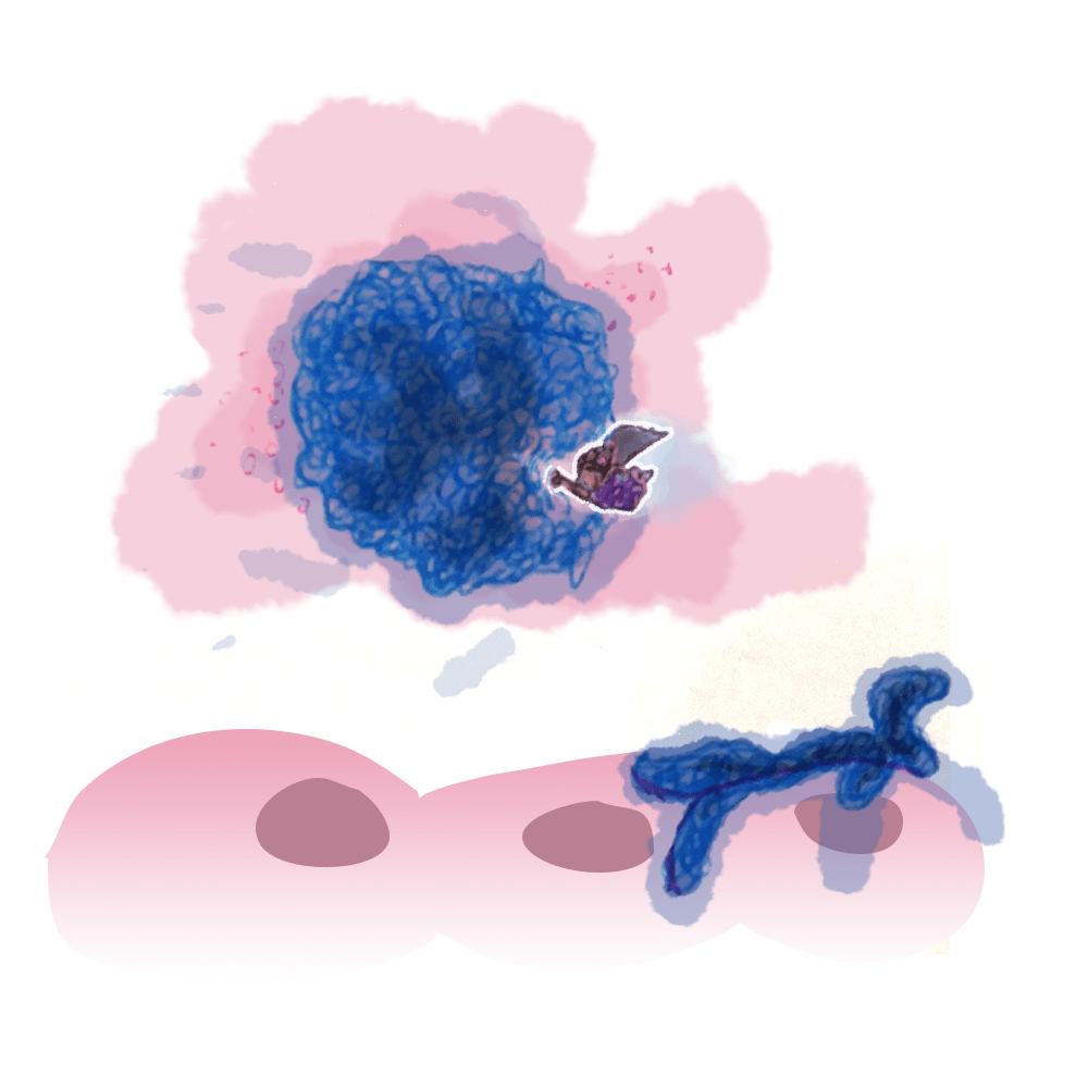
In this design, which is a card from one of the courses I illustrated for Lifeology, I wanted to convey the disorganized way that cancers grow.
To convey that message, I drew the cancer as a bunch of squiggles. I literally used a pen and made circular squiggles until I had the entire form filled in. I think it worked out beautifully! The cancer really has a lot of character because of the addition of texture.
Maybe you don’t want to make the texture yourself. Well, I’ve got a few ideas that can help!
These abstract memphis patterns are adorable! I’d love to see these used in a design somehow. If you want to have a little more control over your texture, you should check out these Curls, Swirls, and Squiggles Illustrator Brush Bundle. Last, if you’re looking for something more organic, you should definitely pick up Squiggles, Dots, and Lines, which are custom designed textures that are bold, quirky, and really versatile!
But blatant texture doesn’t suit every piece. Sometimes it can be overwhelming, and other times, it can seem gaudy.
Subtle Texture
Even a minimalistic design can benefit from using texture. It’s just a slightly different way of placing the texture. When going for subtlety, your focus should be on letting the texture blend into the background. It doesn’t always have to be in the background, it just needs to add some life.

Take a look at the beige background in the infographic above. It’s subtle, but there’s an interesting diagonal pattern there. Since there’s not much texture going on in the piece except for the lungs, I wanted to make the flat elements stand out more. I did that by using texture. Instead of the beige feeling like it’s pulling everything else in, it actually helps the other elements stand out.
I made that texture myself, but there are also some great textures that you can pick up and use to your heart’s content! One of my favorite is a paper texture because it really adds an organic look to a piece. If you pair it with small, sharp drop shadows, it can really give a unique design that feels like bringing the digital world into the analog! Another great option is just adding some grit. Textures like these grunge patterns work extremely well to set the tone of a design, or turn the opacity down to make it even more subtle.
Sometimes, a subtle texture really just means that the texture isn’t too busy. Finding more organic elegant textures can add flavor to a piece that’s feeling a bit blah.
Accent Texture
The last way of using textures that I want to talk about is as an accent. This really comes down to using texture to help your audience know where to look. There are many methods to direct the audience’s attention, but texture is a foundational example. Our brains take in everything our eyes give us and try to make sense of it. The brain is an expert at putting things into groups. The more alike things are, the more likely the brain will see them as the same. More importantly, things that stand out tells our brain that there is something interesting to look at!
Using texture for this kind of emphasis can be seen in the example below.
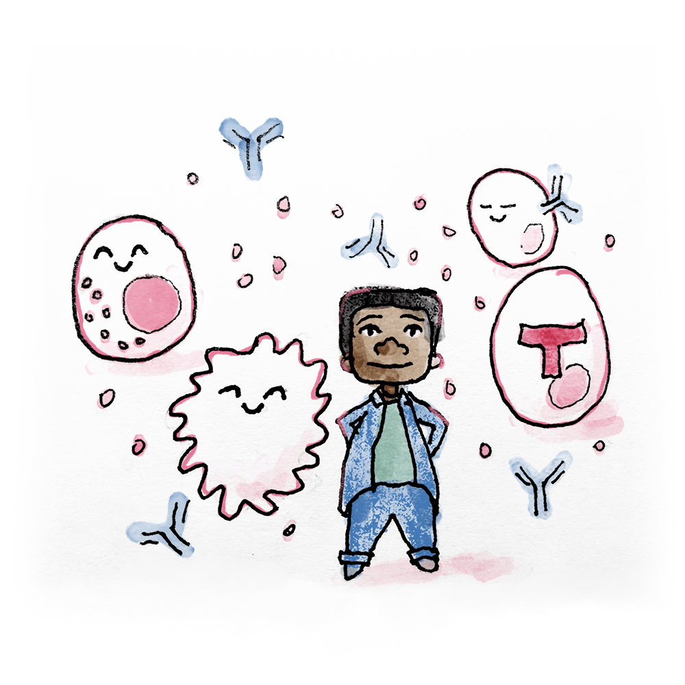
I chose to focus most of the texture on the character, Dave. Even though the other characters (members of the immune system) have some texture, Dave’s coat, pants, and hair all have a harsh texture to them. The other characters and background have a much softer texture.
This intentional choice was made to keep the focus on our hero. Paired with an accent color, a good composition, and other good design skills, your audience will effortlessly navigate your artwork.
If you’re ready to start adding texture with shading, this grain shading brush set for Illustrator is to die for! The grainy look of shading flat design is incredibly popular right now. Another great place to think about texture is in the fonts you use in your design. This hand-drawn font caught my attention because of its classic look paired with some really nice edge texture. And if you’re looking for something bold, consider using textures that come through from the background. This is especially cool looking with peeking through a nice thick font! Something like these sparkling ink textures are a great pop of color, which would go nicely in an otherwise simple design.
Using Textures Can Enhance Any Design
I hope you can see in my examples how strategic use of texture can make your next art piece pop! Thinking about texture is actually one of the least stressful parts of drawing for me because I can usually add them at any point in the design process. It’s great if you are thinking about it from the start, but I’ve found that even if I decide at the last minute to add some texture for interest, it’s easy to implement and increases the value in a huge way!