How Does Cancer Grow? Behind the scenes of the course
Creating the visuals for a Lifeology course isn’t always a linear process. Here’s a behind the scenes look at my “How Does Cancer Grow?” course.
Getting started creating the How Does Cancer Grow course
My name is Gaius, and I’m a PhD trained scientist with a background in the fine arts. I’m now putting it all together to tell beautiful stories about how our world works. From scripting to brainstorming, from sketching to rendering, every step in the process of crafting a Lifeology course requires a lot of trial and error. There are lots of things to consider.
How much text can fit on each card? What’s the tone of the story? Who are the characters? What style of art should be used? How much jargon is necessary?
The most important part for me was the editing process. Luckily, the team at Lifeology had me covered, and the process was so much easier having them helping me along the way. Since my background is in cancer biology, I felt confident writing a course about one of the central concepts in the field. In an article called about the so-called “Hallmarks of Cancer”, the authors go through 10 properties of cancer.
I wanted to focus the course on how the body’s natural defenses work to keep cancers from growing. I also wanted to cover how, when those defenses fail, treatment plans can be developed based on properties of the cancer. Thanks to the Lifeology crew’s editing, we crafted a story that I really love.
Defining the art style & technique
I had an idea for this course before I started. I wanted something with texture and movement.
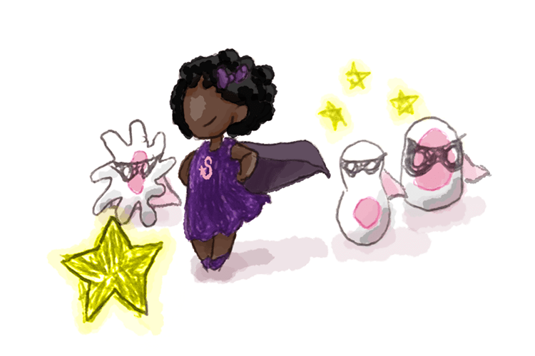
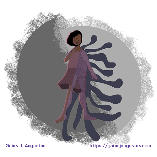
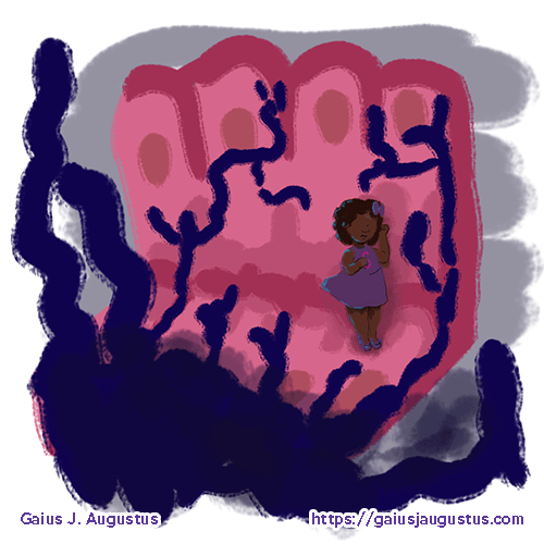
Below are three concept art pieces that I created while trying to find the perfect art style. Finding the balance between style, time, and tone was challenging. These concepts all have great potential, but in the end weren’t quite what I wanted as is.
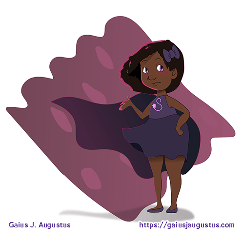
The first, with the gray circle background, was really nice. I liked the style as well as the texture. I used a variation of this image in the final course, with changes to the textures and the design for the “cancer”.
The second, with the billowing cape, was amazing. I would have loved to have done the entire course in this style, but it was lacking the texture that I really wanted. This style was also incredibly time consuming to create, so I chose to put it aside.
The third one really spoke to me. I loved the texture as well as the imagery. I loved seeing Shaundra (the character) in a true environment. But as much as I loved this style, it was pretty dark and spooky. I went with a similar style for the final, but calmed the tone down a bit.
Final art process
For the final process, I chose to take a different approach. The above images were all completely digital, either using Photoshop, Illustrator, or a mix of the two. I decided to use a traditional technique to get the texture I wanted.
I put together the following examples to show how traditional and digital media worked together for the course.
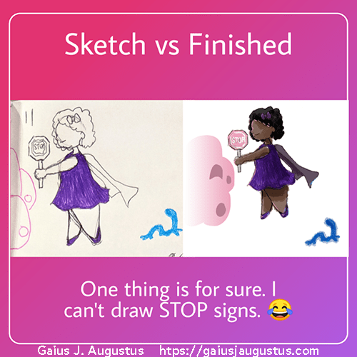
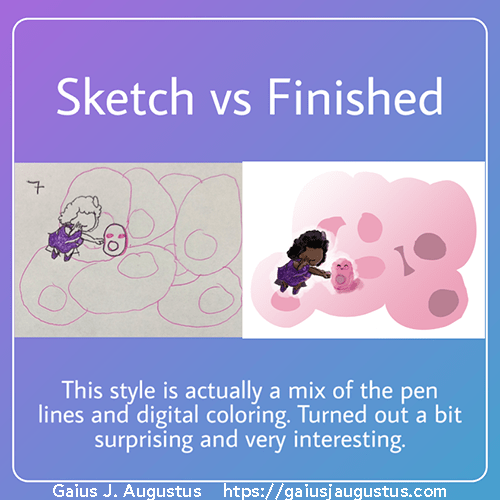
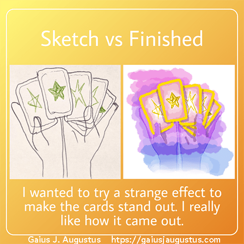
Here’s the process of how I created them. I have a set of colored ink pens, which I used to create the initial sketches. To digitize the sketches, I took pictures of those sketches and pulled them into Photoshop. I cleaned up the linework, fixed the composition, and added washes of color.
For the cards that depict inside the body, I made the cellular backgrounds less textured. This gives a nice contrast that helps the characters stand out from the background.
For cards that depict outside the body, I decided that I wanted something colorful and abstract. I decided to use a gradient effect over the “real life” characters. This focuses the art on the conversation about treatment options, while also giving the cards a different flavor than the inside the body cards.
It took quite a bit of experimenting to find the right color palette, but I was highly inspired by these 2 colored ink pens I used for the initial sketches. I’ve always loved sketching with them, and after all the concepts I’d tried, things just suddenly clicked once I brought the pens out. When things come together in this way, I try to go with the flow and let the art come together on its own.
Completing the Lifeology course
After creating over 30 art pieces for this course, the Lifeology team generates a prototype so that I can make sure that the final piece works well within the framework of a card-based course. Typically, I need to change some small details here or there. These changes often are things like changing the size of the art, removing extraneous detail that doesn’t show up on a small card, or changes to the order or text of the cards.
The “How Does Cancer Grow” course is about how the understanding of the biology of cancer helps healthcare and research teams to find ways to combat it, but it also celebrates the amazing work that our biology does in order to survive in the very dynamic world that we live in. I’m amazed by the complexity of how nature works, and excited to have the opportunity to share how it inspired me to create this course.
If you’d like to see more of my work, check out my portfolio. Want to work with me on a creative project? Contact me today!